Complexity in webdesign
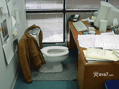
 Ever heard of ‘less is more’? This is, more than ever, a standard that every developer should follow while designing his new website. Why the f* would I start talking about that, you can ask yourself. Well, the answer is quite simple, as I was going to the toilet earlier this day and was in deep thoughts with the question: why isn’t everything designed and created as simple as a toilet room?
This is one of the only rooms and spaces in the world where you only find exactly what you need for the job and nothing else. No rubbish, no extra stupid information, just 3 simple things: a toilet, toilet paper and a little sink to wash your hands. These 3 things can easily be compared to 3 actions: brew, act, finish.
The same structure should be kept in mind when creating a website. Each page should contain only the information exactly needed without mixing up different parts together to one big pile of sh*t. Users don’t find the good or simplest way to the data they need. You would think that this is a very simple rule, but a lot of designers and organizations seem to forget this, so please, take your time while designing.
How can you do that?
A good idea doesn’t mean that your site will be a great success; you have to think it trough. You can start by taking your time to do a good analysis of the idea, work out the big lines before thinking of the details. Write down the major goals of the site and use them along the way to stay on the correct path. Split your site up into 5-6 major pieces as they will be the menu of your site, and be sure that this is a good structure. There is nothing more annoying for a developer then changing of big parts as they are in code named the same way.
For example, if one part of your site is called ‘Contact’, and after 3 months of development you decide to call this part of the site ‘About’, all code that the viewer doesn’t see will still be referred to as Contact.
2 options for a developer in this case, you can stop bothering yourself and don’t do any changes or change all contact to about, spend a lot of time doing this, but get a better result. I guess you see the picture why this is important.
In the frontend (for designers) this is actually the same story. Try to create a view (without design) where you should place every part, and be sure about the positioning, as this is very frustrating for a designer if this changes after designing the layout. A template and/or layout is often created for or in function of specific parts on each page, so if they are replaced, your page could easily get another layout and impression.
Try to put only the necessary content on each page, the only thing that can be put in a page besides the data are links to other parts of the site. Don’t put products on about pages; don’t put contact information on a product page. If I wanted the contact information, I would’ve clicked the contact button.
Try to keep these things in mind as they will ease up the path to a simple, clean website and only correct data will be displayed because: less is more!!!

Comments